Exporting and communicating
A.Bailey
Learning Objectives
In this lesson the learner will:
- Turn the R script they have created into a shareable report.
- Export data for sharing in CSV format.
- Export figures in pdf or png format.
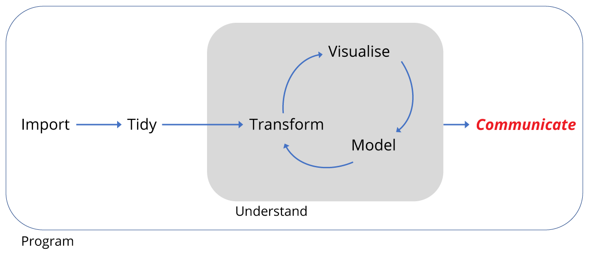
Motivation
Recall that we began with a data set of around 35,000 observations covering 40 species spread over 24 plots.
We have imported and transformed the data to both subset the observations and variables of interest, and to summarise the data. We then plotted the summarised data. We did this all in a R script.
As mentioned at the start, it’s good to think of the script as the reality of the analysis. It contains all the code necessary to reproduce the analysis, and unless we change the code or the data we import, it should reproduce it exactly every time we run the code. So it’s a really important document.
However, not everyone can use R, and we might wish to communicate the analysis outside of the R environment. Therefore we need to be able to export data too.
Here we’ll briefly cover three aspects of exporting:
- exporting data in spreadsheet form
- exporting figures for use in documents or presentations
- turning our script into a report
This last point is particularly useful in situations such as writing a dissertation or manuscript where you might need to include the code you used in an analysis.
Exporting data
The simplest way to export data for excel is to output our data frame as comma separated variable (.csv). We can either do this using write_csv for a general csv format, or in an excel specific csv format write_excel_csv().
In my project directory I’ve created a folder called data_output to export files to.
The write functions can take a number of arguments, but in the simplest form we need to provide the name of the data frame we’re exporting, surveys_subset and a character string for the location and file name we want to save. Here that’s "data_output/surveys_subset.csv". The forward slash indicates the file is going in the data_output folder.
# Write surveys in csv format
write_csv(surveys_subset,"data_output/surveys_subset.csv")
# Write out an excel formatted csv
write_excel_csv(surveys_subset,"data_output/surveys_subset_excel.csv")
Having run the code, can open the files up to have a look.
There’s lots more information on data export here: R Data Import/Export.
Exporting figures
Another common task is to export figures for presentations or to put in a document. Two common formats are portable network graphics (.png), good for PowerPoint, and portable document format (.pdf), good for high quality documents.
The best way to export figures in R is using code that opens a file in the format you require, makes the plot, and then you close the file. It’s important to remember to close the file.
First we’re going to create our plot as an object instead of plotting directly as we did before:
# Create the plot as an object called pub_plot
pub_plot <- ggplot(data = by_quarter,
                   aes(x=quarter, y=captures, linetype = plot_type,
                             shape = plot_type)) +
  geom_line() +
  geom_point() +
  facet_wrap(~ rodent_type, nrow = 2) +
  scale_x_continuous(breaks = seq(1978,1990,2)) +
  labs(x ="YEAR",
       y ="CAPTURES / PERIOD",
       linetype = "",
       shape = "") +
  theme_linedraw() +
  theme(axis.text = element_text(size = 12, face = "bold"),
        axis.title = element_text(size = 12, face = "bold"),
        strip.text = element_text(size=12),
        panel.grid = element_blank(),
        aspect.ratio = 0.6,
        legend.position = "top")
Now we have our figure as an object called pub_plot we can plot it to any format we wish, just by calling the object.
Here are two bits of code for exporting the same figure as a png and as a pdf.
## Write out a png of the figure
# Open a png file and give it a name
png("fig_output/capture_of_rodents.png")
# Create the plot
pub_plot
# Close the file
dev.off()

# Write out a pdf of the figure
# Open a pdf file
pdf("fig_output/capture_of_rodents.pdf")
# Create the plot
pub_plot
# Close the file
dev.off()
Both these functions can take lots of other arguments, so check out ?png and ?pdf for more details.
Compiling scripts into reports
Finally, we can turn our code into a report. This is one reason why good comments are important, as our comments become the text of the report. By writing the analysis code and the report at the same time can save us duplicating our efforts.
For a more sophisticate approach, check out the R Markdown chapter of R for Data Science. Here we’ll do a simplified approach.
At the top of our script, insert some comments lines in the following form:
#' ---
#' title: "Name of report"
#' author: "Your name"
#' date: "Today's date"
#' ---
Note the #' form of the comment line, with an apostrophe, this tells R to interpret this code to create the report header when we compile the script.
In the rest of the script we can use #' to create comments we want to be converted to regular text when we compile the script. Putting nothing after the #' creates a blank line.
We can also create headings, for example:
#' This would be a line of regular text
#'
#'# A big heading
#'
#'## A smaller heading
#'
#'### An even smaller heading
This form: #+, can be used for controlling figure sizes:
#+ fig.height=10
pub_plot
Take a moment to insert some of these kinds of comments into your script, our example is below.
#' ---
#' title: "Competition in Desert Rodents"
#' author: A. Bailey
#' date: 21st June 2017
#' ---

#' This script recapitulates some of the analysis found in the 1994 paper by
#' Heske et. al., Long-Term Experimental Study of a Chihuahuan Desert Rodent
#' Community: 13 Years of Competition, DOI: 10.2307/1939547.
#'
#' This paper examined the effect on the populations of small seed eating rodents
#' as a result of the exclusion of larger competitor kangeroo rats over a period
#' from 1977 to 1991.
#'
#'### Load the tidyverse set of packages
library(tidyverse)
library(forcats)

#'### Read in the data
#' Assuming the data has been downloaded to the data folder:
surveys <- read_csv('../data/portal_data_joined.csv')

#' This data has 34,786 observations of 13 variables.
#' #'
#' We only need the observations for 8 species and 8 plots.
#'
# Kangeroo Rats:
# DM    Dipodomys merriami          Rodent  Merriam's kangaroo rat
# DO    Dipodomys ordii             Rodent  Ord's kangaroo rat
# DS    Dipodomys spectabilis       Rodent  Banner-tailed kangaroo rat

# Granivores:
# PP    Chaetodipus penicillatus    Rodent  Desert pocket mouse
# PF    Perognathus flavus          Rodent  Silky pocket mouse
# PE    Peromyscus eremicus         Rodent  Cactus mouse
# PM    Peromyscus maniculatus      Rodent  Deer Mouse
# RM    Reithrodontomys megalotis   Rodent  Western harvest mouse

# Create a vector for the experimental plots, four controls, four kangeroo rat
# exclusion plots
exp_plots <- c(8,11,12,14,3,15,19,21)

# Create a character vector for rodents
# Create a named vector as a lookup table, where the names of each vector
# element correspond with the species_id, and the values of each vector
# element are either Kangaroo Rat or Granivore
lut <- c("DM" = "Kangaroo Rat",
         "DO" = "Kangaroo Rat",
         "DS" = "Kangaroo Rat",
         "PP" = "Granivore",
         "PF" = "Granivore",
         "PE" = "Granivore",
         "PM" = "Granivore",
         "RM" = "Granivore")

surveys_subset <- surveys %>%
  # Filter observations from 1977 to 1990, for the 3 K-rats and 5 granivores,
  # and for the 4 experimental plots
  filter(year <= 1990,
         species_id %in% names(lut),
         plot_id %in% exp_plots) %>%
  # Use lookup table to create variable to indicate whether species is K-rat
  # or Granivore
  mutate(rodent_type = lut[species_id],
         # Make combined date variable
         date = lubridate::dmy(sprintf('%02d%02d%04d',
                                       day, month, year)),
  # Add the quartley period
  quarter = lubridate::quarter(date,with_year = TRUE)) %>%
  # Drop unwanted variables
  select(-sex,-hindfoot_length,-weight)

#'### Summarise data
# Summarise the data by rodent type, quarterly survey and plot type
by_quarter <- surveys_subset %>%
  group_by(rodent_type,quarter,plot_type) %>%
  summarise(captures = n()/3)

#'### Plot the data
# Create rodent levels by getting the unique values for rodent type
# and putting them in reverse order for plotting
rodent_levels <-  rev(unique(by_quarter$rodent_type))

# Convert rodent_type to factors such that Kangeroo rat is first and Granivore
# is second
by_quarter$rodent_type <- factor(by_quarter$rodent_type,
                                 levels = rodent_levels)

# Now recreate the published figure in black and white
pub_plot <- ggplot(data = by_quarter,
                   aes(x=quarter, y=captures, linetype = plot_type,
                             shape = plot_type)) +
  geom_line() +
  geom_point() +
  facet_wrap(~ rodent_type, nrow = 2) +
  scale_x_continuous(breaks = seq(1978,1990,2)) +
  labs(x ="YEAR",
       y ="CAPTURES / PERIOD",
       linetype = "",
       shape = "") +
  theme_linedraw() +
  theme(axis.text = element_text(size = 12, face = "bold"),
        axis.title = element_text(size = 12, face = "bold"),
        strip.text = element_text(size=12),
        panel.grid = element_blank(),
        aspect.ratio = 0.6,
        legend.position = "top")

#+ fig.height=10
pub_plot

#'### Export the data and figure
#' Export the subsetted data as a excel readable csv file
#' and export the figure as pdf.
#'
# Write out an excel formatted csv
write_excel_csv(surveys_subset,"data_output/surveys_subset_excel.csv")
# Write out a pdf of the figure
pdf("fig_output/capture_of_rodents.pdf")
pub_plot
dev.off()
When we’re ready we can now knit our scripts to a choice of several formats. Go to File > Knit Document and we’ll be asked to choose an output. Stick with HTML and press Compile.
Once it has compiled, you should see a html file in your file window. Click on it and choose View in Web Browser.
Try compiling again, but choose a different format.
Conclusion
In this lesson we’ve followed the data workflow to import data from a spreadsheet, transformed it by learning how to filter observations, select variables and create new variables and then summarise the observations. We then visualised our summarised data in several ways and reproduced the general finding that smaller granivore populations are affected by kangaroo rat abundance.
In this last section we’ve looked at how the analysis can be communicated by exporting the summary data, figures and reports.
All of these steps are common to many data sets, so hopefully you can build upon the methods covered here to increase the speed of your analysis, the robustness of your analysis, and your ability to communicate you understanding to others.
Data Carpentry, 2017.
License. Questions? Feedback?
Please file
an issue on GitHub.
On Twitter: @datacarpentry